Friday, 1 May 2015

Pride Analysis

Pride Film Poster

The film 'Pride' is based on a true story which depicts a group of lesbian and gay activists who helped raise money to aid families affected by the British Miners Strike in 1984. The outset which would become the 'Lesbians and Gays Support the Miners Campaign. The National Union of Mineworkers accept the groups support with reluctance due to the union's public relations worries about being openly associated with a gay and lesbian group. This results in the activists deciding to take their donations directly to Onllwyn, a small mining village in Wales, resulting in an alliance between the two communities. The alliance was unlike any seen before but was overall successful.

The film poster depicts the film itself quite well as the title 'Pride' is written in the shape of a megaphone which are commonly found in strikes of any kind and more than likely founding a miners strike. The use of the title 'Pride' is also a play on the meaning as it can be associated with 'Gay Pride' as well as the miners pride. The positioning of the cast in a V formation is very effective too as it places the well known cast at the front (Bill Nighy and Imelda Staunton) and as the line goes backwards we get the supporting cast. Located at the back are the 'gay' cast. They could have been placed here not to show homophobia but because placing the gay cast at the front may lose potential audiences but having the gay cats still on the poster allows them to be seen and represented thus bringing in several different audiences:
  1. Welsh communities.
  2. People who were involved or around at the time of the Miners Strike in 1984.
  3. The Gay and Lesbian community.
  4. The Older generation due to the cast (Bill Nighy in particular) being in several other well known films that have an older target audience (The Best Exotic Marigold Hotel, Love Actually).
  5. A teenage audience (15-19) due to the humour used.

Pride Film Trailer


The 'Pride' Film trailer begins using Welsh stereotypes such as Welsh Choirs and the setting of hills and countrysides - something Wales is known greatly for. Around six seconds into the trailer there is a caption stating 'Deep in the Valleys' - Wales is also known for having people from the 'valleys' who have a distinctly stereotypical strong welsh accent as well as upholding welsh traditions that are known to be typically 'welsh'. This gives the audience an idea of whats in store within the trailer. Then suddenly at around sixteen seconds the choir music stops and an elderly welsh woman says 'Guy! Your gays have arrived'

Regional and National Identity

Regional Identity

Example One - Essex Girls

Essex girls are stereotypically seen as being blonde and fake (tans, nails hair extensions) it's also been stereotyped that Essex Girls lack intelligence and have low moral standards. An example of this in observation is used on 'The Only Way is Essex' (TOWIE). Throughout TOWIE there are story lines following relationships between friends and lovers and conflicts occurring on nights out. The following clip is a perfect example of such antics.


In the clip Gemma Collins argues with James Argent over his 'disrespect' towards her saying she's got a pretty face but a low IQ and for telling his friends about their sex life together. Within TOWIE these kind of arguments are normal and some are constructed to make good TV and its likely this scene was constructed as there is little fight back from James towards Gemma which is unlikely to happen in real life.

Example Two - Nuneaton Cannabis Raid

http://www.nuneaton-news.co.uk/Cannabis-factory-raided-Nuneaton-home/story-26261473-detail/story.html
Although Nuneaton isn't known worldwide the locals living in and around Nuneaton will know that Nuneaton is often slated for inhabitant having something to do with drugs whether its that you take them, grow them, or just know someone who is involved in them. This news article gives a negative representation of nuneaton and the surround area's due to the involvement of constant drug raids.

Example Three - 

Representation of Events

What language and visual codes are being used?

The main headline for the newspaper is 'Runaway Jihadi's father is Labour Activist' the Daily Mail have made the link that due to the Jihadi's father being a labour activist it means that Ed Milliband must have had something to do with it. This obviously isn't true but the Daily Mail's readers are 53% Conservative Supports, 21% are Labour and 17% for the Liberal Democrats according to a survey in 2004. This surgery was over ten years ago but the readers undoubtably haven't changed a lot in the past ten years with the exception of the UKIP Party appearance in the past few years.

The visual codes used here include the main headline as well as a headline saying 'Briton arrested on Syria border is councillor's son' this is also giving the Labour Party a bad name and reputation though its highly unlikely again - that Ed Milliband had anything to do with this event either.
The pictures used on the page also include Ed Milliband giving the impression to the reader that due to Milliband's appearance on the newspaper he must have been involved. Its a 'guilt by association' ploy made by the newspaper.

What language and visual codes are being used?

Focusing on the headline 'Cool Cameron on top... But Farage keeps up fight on EU and migrants' this headline is a fairly negative portrayal of Farage the leader of the UKIP party. UKIP policies in regards to 'Controlling and managing the UK borders'  include:
  • UKIP recognises the benefits of limited, controlled immigration.
  • UKIP will leave the EU and take back control of the UK borders. Work permits will be permitted to fill skills gaps in the UK jobs market.
  • Extend to EU citizens the existing points-based system for time-limited work permits. Those coming to work in the UK must have a job to go to, must speak English, must have accommodation agreed prior to their arrival and must have NHS-approves health insurance.
  • Migrants will only be eligible for benefits (in work or out of work) when they have been paying tax and NI for five years and will only be eligible for permanent residence after ten years.
  • UKIP will reinstate the primary purpose rule for bringing foreign spouses and children to the UK.
  • UKIP will not offer an amnesty for illegal immigrants or those gaining British passports through fraud.
  • UKIP will return to the principles of the UN Convention of Refugees which serves to protect the most vulnerable.

Tuesday, 24 March 2015

Paper Towns Trailer

After watching 'Paper Towns' I've realised that the target audience is 15-25 year olds specifically but obviously John Green has a way of writing books and thus films are created that manage to attract all kinds of people of different age and gender. For example, the comments on the official trailer on youtube have a comment by 'VlogBrothers' - John Green's shared youtube account with his brother in which there is a comment saying 'The Q, Ben, Radar group looks so freaking cool. I want to be in that friend group! And I am 34 years old! You can how old I am by how I'm here for the buddy comedy, which will be at least as good as the romantic dramedy bits of this movie. Congrats, John! - Hank' This shows that despite being the creators brother, the film has as appeal to a 30+ audience and most likely children in high school (11+) too due to the 'coming-of-age' likeness and the kind of fairy'tale 'looking-for-love' aspects. 


I believe the appeal and attraction to Paper Towns is that mystery behind what happens to Margo and the kind of wonder that is put in the narrative voice in the trailer. This can be appealing because mystery makes people want to know what happens and watch the journey Quentin goes on not only to find Margo but to find himself. This is appealing to 15-25 year olds because we all want adventure and while still young we believe it to be possible. 

Another appeal is the music used in the trailer itself (Smile - Mikky Ekko, To The Top - Twin Shadow). In regards to the song Smile; the music is quite happy and hopeful. This music appeals to me personally because it makes me feel as though anything is possible and the film is focusing on just that ideology that anything is possible and that life is full of adventure and finding love is possible. Whereas To The Top gives the ideology of adventure and discovering the wonders of the world.

Thursday, 5 March 2015

Positive and Negative portrayals of Race, Ethnicity and Colour in the media.

Dear White People

Dear White People can be argued to be both a positive and negative representation on race and colour in the media.


Dear White People is a film made in 2014 about the stereotypes made of black people in America. As seen in Trailer One the group of black people are questioning a cinema employee as to why films shown only show "Black people dying in the past and black people dying in the present". The language the characters use and the slang are that of what is stereotyped to be used by black americans like at 00:40 - 00:47 when the group reacts to Two Chainz being in a film. This bring humour to the film as the film explores racial identity in acutely-not-post-racial America while weaving a universal story of forging ones unique path in the world. I think this film is a positive representation of race etc to an extent because of the comedy used and the blatant intent of stereotyping. I know this because I went and saw this film in cinema with a friend and being one of the five/six white people in the cinema i noticed that the films intent and stereotyping was seen as comical to everyone in the theatre thus proving its intent was not to be racist but to make fun of white people for stereotyping certain words or body gestures to black people not only in America but in England too.
In Trailer Two the first half shows a young girl speaking over a radio intercom with a show called 'Dear White People' and she lists off the different things that white people do that she deems racist. These include:
  1. "The minimum requirement of black friends in order to not look racist has been raised to two. Sorry but your weed man Tyrone doesn't count"
  2. "Touching guys affro is annoying. This isn't a petting zoo"
  3. "Dating a black guy to p*ss off your parents is a form of racism"
These assumptions and accusations can be seen as humorous as they're clearly intended to be humorous. The assumption that white people immediately touch a black persons affro is a stereotype as well s the stereotype of a persons dealer being black and called Tyrone.
There is also the quote "Black people can't be racist. Prejudice yes, but not racist. Racism describes a system of disadvantage based on race. Black people can't be racist since we don't stand to benefit from such a system."

Tuesday, 3 March 2015

Representation of Ethnicity

Rihanna, Kanye West & Paul McCartney
Rihanna is originally of Barbadian heritage and throughout her time as a music artist she has done practically every musical genre there is. Her most recent being 'FourFiveSeconds' which is "pop and soul pop song with country and folk music influences and an instrumentation consisting of an acoustic guitar" as well as being described as "country-tinged" acoustic and "stripped down" pop and soul pop song with a folk feel".
This song was recorded alongside American Rapper Kanye West and English Musician Paul McCartney. Throughout the music video there is no colour used apart from black and white which plays on the ethnicity of each individual.
As well as ethnicity, there is a hint of sexualisation especially from Rihanna as she's seen to be wearing a large denims jacket done up with a belt giving quite a grunge appearance alongside Kanye who is wearing similar clothing. Rihanna's makeup is quite minimal compared to her make up in other music videos the same applies with her hair too which is hanging down put is pulled away from her face. 
Rihanna is sexualised but not completely through her body and through unity like most women in music videos are. She is sexualised through a more natural means as she looks quite simplistic and her clothing doesn't reveal music flesh the whole way through the music video and her clothes as well as flattering her don't actually give away Rihanna's figure thus making men believe her to be slim. With what she's wearing it would be unclear to tell if she were slim or not.
The whole music video kind of breaks the stereotypes of ethnicity because its not very often seen that  black/barbadian people engage in country/folk stylised music.

Tuesday, 10 February 2015

Camera Angles and Representation

Savage Grace

This shot is an establishing shot. This is known as an establishing shot as it confirms to an audience where the film or this particular scene is to be set and at what time of day too. An establishing shot is typically used at the beginning of a scene to establish the setting for said scene. In this sense we establish that the film is set in England and this particular scene is at night or dawn due to the low key lighting and the horizon having a sense of run rise or sun set die to the yellows and oranges. 

However this shot is known as a close up which usually depicts certain emotions on a character and shows them to the audience. In this shot we see the woman at a party seen by her dress (not in this shot in another one before she moved) and by her hair style and make up. We also get a sense of the time era as well as she is styled like people were in the 60's/70's.
As well as being a close up this was also a part of a Shot Reverse-Shot too. In which a shot in used likely during a conversation between two characters and the shot changes from one persons perspective, to the others, and then back again. This is effective as it shows both characters reactions within a conversation and their actions too.

Finally an example of a mid shot can be seen above as well as a shot using the rule of thirds. This shot not only views the two characters but also the scenery behind them indicating they're in public, again in a different time era due to their clothes and style. This is recognised as a mid shot because the shots has half their body in to about mid way. 
This uses the rule of thirds too as the characters are located in the last thirds of the screen and the first tow are filled with the background and the scenery. This is effective as its a change in the use of shots and can possibly make way for someone to appear within the left hand side of the screen. This also allows an audience to see the miss-en-scene of the background which - again - helps set a time era, a location and an idea of the time of day (day/night).

Tuesday, 3 February 2015

This Girl Can

This Girl Can

In the 'This Girl Can' video women are completely breaking out of the presumed stereotype. This is done through the use of women of all shapes, ages, assizes being used within the video. All of which are exercising and having fun whilst doing so, this is sending a message to the audience that women are breaking out of their stereotypes and are comfortable in their own bodies. Something that everyone should feel.
The advert constantly shows signs of encouragement for women such as 'I jiggle, therefore I can', 'Feeling like a fox', and 'Damn right I look hot'. These messages encourage women as it makes women feel as though they are good enough no matter how they look and that they can exe rice for their health or just because they find it fun.
Different ages are used within the advert too, this widens the target audience from teenage girls to older women. The use of this not only widens the target audience for marketing value but to spread the message across a wider audience. As a teenage girl, body image becomes very important and this carries on throughout your life, when women get older however it sometimes becomes less so as there are other priorities, the video encourages women to take back their body image.
The 'This Girl Can' video shows women that they can look good no matter if they're fat, thin, older or younger and regardless of how they're clothed. This is seen through the use of a women who is bigger wearing a bikini and still being encouraged to look good, as well as people running in shorts when some may depict it unattractive for them to wear such clothing due to size or age.
There is also an array of different sports used to prove that no matter what you're doing (sport wise) women still look good doing it. The 'This Girl Can' video encourages this emmensly.

Thursday, 11 December 2014

Representation of Age - Exam Prep

Find 3 specific examples of the representation of age in the media from a variety of contemporary texts (these must be from the last 2 years)

Advert (include year of advert)\

SMA Advert - 2013

This represents the age of children. There are eight main stereotype categories for children.

  1. As victims of horrendous crimes - Some critics of the media have suggested that While children who are victims of crime get more media attention than adults or children from ethnic minority backgrounds.
  2. As cute - This is a common stereotype found in television commercials for baby products or toilet rolls.
  3. As little devils - another common stereotype especially found in drama and comedy,  e.g. Bart Simpson.
  4. As brilliant - Perhaps as child prodigies or as heroes for saving the life of an adult.
  5. As brave little angels - suffering from a long-term terminal disease or disability.
  6. As accessories - stories about celebrities such as Madonna, Angelina Jolie or the Beckham's may focus on how their children humanise them.
  7. As modern - the media may focus on how children 'these days' know so much more 'at their age' than previous generations of children.
  8. As active consumers - television commercials portray children as having a consumer appetite fro toys and games. Some family sociologists note that this has led to the emergence of a new family pressure, 'pester power', the power of children to train or manipulate their parents to spend money on consumer good that will increase the children's status in the eyes of their peers.
This advert portrays children as 'cute' as they're babies ad though they're acting naughty they're still cute to watch and the advert makes people - parents especially - smile or laugh.

Music Videos (pick a particular scene, exact times should be noted)

Break the Rules - Charli XCX

In the first five seconds of the music video we hear the non diegetic sound of a school bell ringing followed by a group of teenagers running down a corridor that's set to look like one you would find in a high school. The students are wearing a typical school uniform including white shirts and black trousers or a black skirt. Some of the students are carrying school folders or books. This all links in with the name of the song 'Break the Rules' as schools have several rules that students usually enjoy breaking. The use of teenagers also immediately gives you a sense of who the central target audience is for the song. This being young adults/teenagers (14-18), presumably females as its a female singer.
When the musics soundtrack begins the camera loses focus of the students running by and focus's solely on Charli and some girls behind her. They're not dressed the same as everyone else indicating they're already 'breaking the rules' by wearing provocative alternates to the school uniform. They're edited to be in a slight slower motion than the previous action to draw attention to Charli and what she's doing and wearing. The girls she is with are all very pretty too which along with Charli appeals to 'The Male Gaze Theory' and thus engages a target audience of males as well as females.
At 00:14 the setting changes to an American football ground's bleachers, the colour's being yellow and dark blue, the blue matching the skirt Charli is wearing and the jacket one of the other girls wears. The weather is also incredibly sunny and bright portraying the song is happy rather than sad. Due to the weather the lighting is soft and high-ish key rather than low key which would give the whole music video a depressing tone.
The scene changes again at 00:17 to only Charli stood on top of an American school bus, its also yellow thus linking into the yellow we saw earlier on the bleachers. The bus appears to also be on the football field with the bleachers in the back ground. The shot on Charli is an establishing/long shot of her and her whereabouts. The fact that Charli is on top of a school bus also links into the songs message of 'breaking the rules'. The she is stood on top of the bus she is wearing a black leather jacket, short shorts that show a bit of bum cheek, there are tassels coming from either her jacket of shorts too that cover part her legs but due to the movement don't keep covering them and sun glasses. Typically fitting the stereotype of a 'bad girl' almost linking to the stereotype of a 'biker chick'.
When Charli and her 'girls' enter the school bus (00:29) the bus driver looks the complete opposite of a bus driver as he has long dark curly hear, a baseball cap and headphones. He looks almost 'grungy' in his appearance and king of like a 'rocker' rather than a bus driver. Once on the bus (which only contains Charli and the girls) they all walk to the back half of the bus, something typically done by the 'bad' kids in a class. None of the girls are sat still, all are dancing or chatting or interacting with Charli who is singing directly to the camera, the shot used in this scene is a mid shot with occasional close ups of Charli herself singing. At 00:47 the girls and Charli begin to throw ripped up paper at each other and the camera indicating they're having fun and are once again breaking rules by making a mess and also ripping up paper as well as standing on the bus seats.
At 00:54 the camera is at a low angle watching at the bus drives past with Charli and the girls all hanging out the windows waving and throwing notebooks and paper towards the camera. For a second the camera closes up on Charli to show her having fun and initially looking like the ring leader of the girls and their behaviour.
Throughout he first minute of the music video the scenes switch from Charli dancing and strutting around on top of the bus, to Charli in the bus singing to the camera or having fun with her friends, or hanging out the bus presumably shouting or laughing; though this isn't heard due to the soundtrack playing but you see the action and intention of laughing or screaming.
After the school bell at the beginning of the music video no other sounds are used other than the soundtrack with Charli singing.


Film Trailers (Pick a particular Scene, exact times should be noted)

Nativity 2: Danger in the Manger - 2012

This is an film trailer specifically aimed at the audience of young children at Christmastime. We know it's aimed at young children because the film - as seen from the trailer - mainly includes primary school aged children.
In the first 10 seconds of the trailer the film misleads an audience to believe that the film is aimed at all ages at Christmastime but then as the trailer progresses we discover that the film is aimed more at a young audience in Primary Schools as the children in the film are all Primary School students as seen from 00:11 - 00:14. At 00:25 to 00:30 we see the teachers assistant 'Mr Poppy' encouraging the children to chase their new teacher around the playground. Something that can be seen as humorous to a young audience as every child would enjoy chasing and scaring their teacher with permission.
Mr Poppy is arguably a child himself despite being an adult as he goes against the Headmasters wishes and holds 'secret auditions' for the Christmas competition 'Song for Christmas' (00:38 - 00:49). This adds to the aspired audience of young children because Mr Poppy isn't like a normal teachers assistant and he encourages the children to do 'mad' and 'absurd' things that would never be done in a normal primary school.
We see more of the shenanigans encouraged by Mr Poppy from 00:58 - 1:11 in which he sneaks the children out the school and into a decorated vehicle, ties up the teacher Mr Peterson and drives across the country to Wales without the head teacher realising immediately and again at 1:15 - 1:20 when he gets into a fight with a rival schools teacher.
At 1:35 - 1:54 we hear the children's Christmas song and various scenes from the Song for Christmas competition and a funny clip of Mr Poppy and Mr Peterson changing a babies nappy.
This is a film blatantly aimed at children in Primary School and younger or young families due to the children in the cast being of that age group too. Though this is the primary audience, there is a secondary audience of other age ranges including young adults and people who enjoy Christmas.


Tuesday, 4 November 2014

Ideas for Film Poster - Coursework

Ideas for Film Poster

  Has to be...

  • Romantic Comedy
  • 16-20 FEMALES
  • Bright & Attractive Colours
  • 'Dramatic' - To an extent

Ideas...

  • Rather than a boy and a girl, I like the idea of doing two girls on the front or the same person twice like 'The Parent Trap' or 'She's the Man'. Simply because it's different and wouldn't require more than two people.


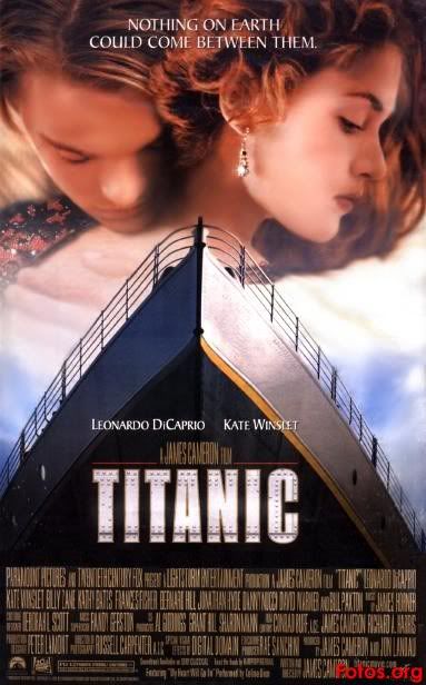
  • I also like posters that have a transition from one image to another like 'The Last Song' or 'Titanic'. This has a good effect to it and would again, be different.


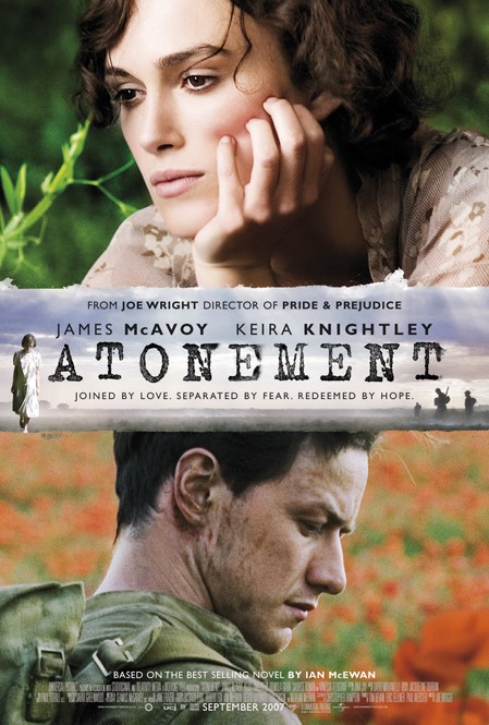
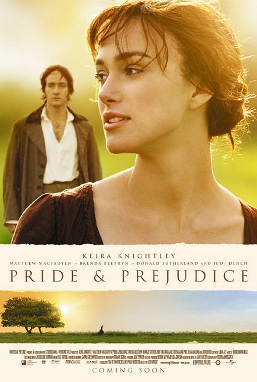
  • One image - Title - Another Image. 'Atonement' or 'Pride and Prejudice'. This means I don't need to have the two cast members together in a photo so I can use them separately.

Film Poster - Final Survey Conclusions - Coursework

After looking at my survey's responses i have discovered that my target audience is mainly going to be based around the age range of 16-20 year olds. For me personally this as easier as i'm in this age category and therefore can base the film poster partially on what i would want to watch in a film or see on a film poster. It has also became evident that my target audience consists mainly of females - amongst these females, six were 16-20 years old. Due to this I will also use a 16-20 year old on my film poster to attract the age group and to target this age group. 
The top voted film genres I had were Romantic Comedy and a Horror or Thriller, each getting six votes. Due to this i had to then look back into which had the most female votes as females were my target audience. This was Romantic Comedy. 
My film poster was also voted to include 'Bright, Attractive Colours', and 'Certain actors in the Films' - unfortunately I couldn't put certain actors in my film poster so i've decided to use the third highest voted option which was 'Dramatic Photo's of the Cast'. Upon discovering this information I've decided to use a single person on my film poster and base the film poster to them, using the rule of thirds and photoshop I will make my poster 'Bright and Attractive' but also 'Dramatic'. 
I also asked if people pay attention to reviews found on film posters, the main response was 'Sometimes' and my second highest voted option was 'Yes'. I therefore will be including some kind of review on my film poster, it's also an idea to put on award badges (for example BAFTA or Emmys etc) as it makes film posters look more distinguished and seeing a film award logo is more likely to draw attention to a film poster and make it look more appealing it the film itself is supposedly good. 
For the 'market research' for my double page spread i asked if people bought and read film magazines to which i got a staggering amount of no's - although the most voted option was 'No' I am still going to write a double page spread but I will use the additional information i discovered to make my double page spread appealing to read. I found out people tend to follow film trailers on Youtube which is something else i can write about in my double page spread that will also help draw in readers.
My survey results also mentioned - like before - the appeal of dramatic photos of the cast so in my doubt page spread I will be using photos of my 'model' to add this appeal.
Overall for my Romantic Comedy film poster my target audience are 16-20 year old females. My film poster will include bright, attractive colours and dramatic photos of the my model as well as these aspects being used in my double page spread. 

Tuesday, 21 October 2014

Kayleigh Manners - The X Factor


The X Factor is one of the UK's biggest entertainment shows and includes every age and gender representation. The programme's used to bring both humour to an audience and entertain that audience, the main aim of The X Factor is to find 'the next big thing'. Doing this includes showing both bad and good auditions from the public this is constructed to make the audience laugh and the bad auditions but love the good ones and make a reaction from the public based on their opinions of the singers. The X Factor also breaks all the stereotypes we associate with gender, age and sexuality.

An example of this is Kayleigh Manners. Although she gives the physical appearance of look 'tough' and confident in herself due to her clothing choices, hair and piercings. When she sang it was clear she isn't tough or confident at all and is very shy.

Age Representations in Music

I've chosen to do my age representation on Sia's 'Chandelier' as it involves a child in the music video.
The song is initially about the singer (Sia) being a party girl and drinking there are also references to sex throughout the song.
The music video however shows a young girl (Maddie Ziegler) aged eleven dancing around an empty flat. Throughout the music video the audience gets an idea that maybe the girl is mad or just alone as she's wearing a tan leotard that gives the impression from afar that she's naked (this indicates vulnerability) and she has drawings all over her hands - something only a child would do if their parents weren't around.
The song was made for young adults/teenagers of around 15/16-19/20 because of the references to sex and drinking and partying - something at this age people tend to do often.
Age is represented in the music not only in this aspect with children but with teenagers being classed as reckless and irresponsible. Women in music are often portrayed as objects of pleasure and not real people, they're also depicted in music videos especially to have sex appeal and often to not wear very little clothing.
Depending on the music and the artist its often easy to predict who the audience is for different songs in different genres - for instance, stereotypically - classical music is aimed at older people whereas more modern music thats in todays charts is aimed at teenagers, young adults and some older members of the public.

Thursday, 16 October 2014

Textual Analysis - Coursework


The first thing that draw your attention to this film poster is the image. Though it doesn't take up the space of the entire film poster, you still immediately look at the image. I personally think that having the image covering only part of the poster makes the film look more sophisticated. The rest of the poster has a plain white background as to not draw attention away from the image.
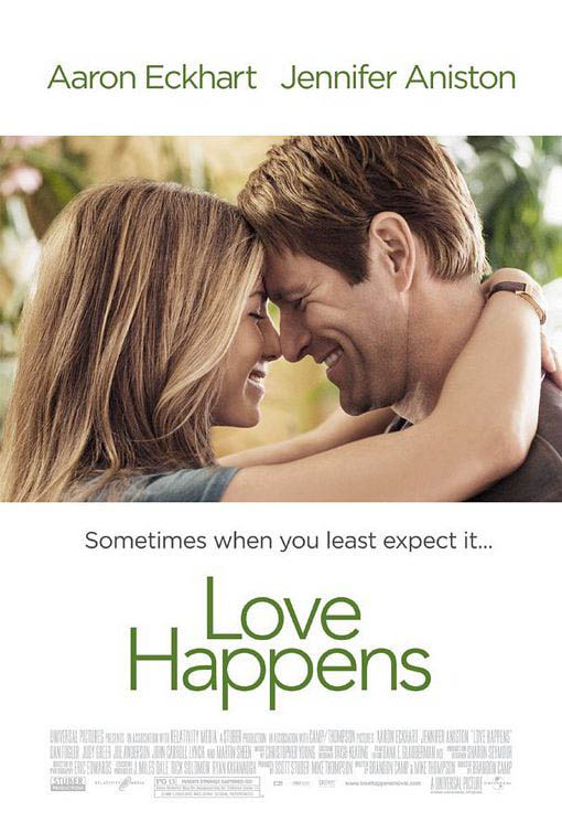
The next thing I noticed was the names of the two main actors starring in the film, Jennifer Aniston and Aaron Eckhart. Having two very well known actors names at the top of the film poster immediately is seen because by habit people will read from top to bottom, it makes more sense to have the actors names at the top rather than at the bottom.
The middle part of the poster is taken up with the films name, the font is extravagant or fancy its actually quite plain and simple, matching the mood of the film poster itself. The colours used in both the photo, background colour and font colours are all quite earthy and plain too.

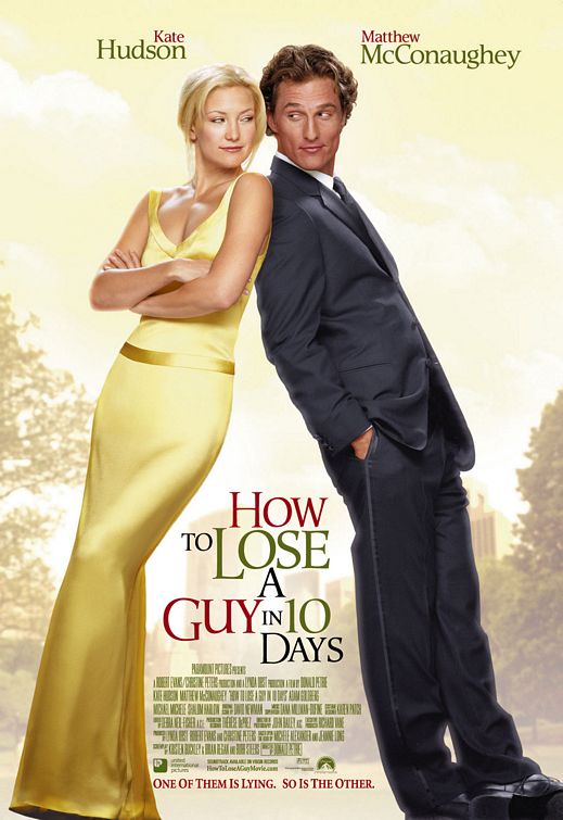
This film poster immediately gives the effect in my opinion of 'elegance' and being 'classy' due to the golden yellow colours used in the background and on Kate Hudson's dress, along with her blonde hair.
The colour scheme in this film poster is hard to depict as one theme - for instance 'earthy' - because the colours used are yellow/gold, red and different shades of green. Though the colours go to together and compliment the film poster well, the colours make all the words stand out at different times.
Like in the film poster 'Love Happens' the two main actors names are at the top of the film poster, partially because they'll be read there but also because these two actors are well known in films also and it will attract audiences from their previous films.
The films name 'How to Lose a Guy in 10 Days' is places strategically between the two main characters on the photo. This is layer out this way because when you're looking at the film poster you scan from left to right like you would when you're reading and by doing this you look from Kate Hudson, to the films name, to Matthew McConaughey.
The layout and style of the film poster is similar to that of a magazine cover, the fonts used are recognised in magazines and the placement of the actors along with any writing is to an extent the same as what you'd find on the cover of a magazine. This all fits into the theme of the film as the film revolves around two magazine companies.
The two actors are leaning up one another but rather than looking 'in love' they look like they're rivals or in competition with one another, they both in a sense look smug. As Kate is wearing an elegant, full length, golden gown she looks rather pure and angelic and Matthew is wearing a full suit in a dark, dark blue or black he looks the opposite. Smart but kind of 'devilish'. This plays with the idea of good V evil or the angel and devil.

Like the two previous film posters I've analysed you can see immediately that the actors names are at the top of the film poster again, their first names are in bright white writing so they catch your eye. The same applies here with the films name, the date the film is released and the slogan 'Friendship has its benefits'.
The layout of the scene also fits the name of the film 'No Strings Attached' as its in a bedroom with Natalie Portman wearing only a shirt that she's buttoning up, her hairs a bit messy and she's smiling at Ashton Kutcher who is sat on the bed with his shirt undone and one leg in his trousers. There is a shoe thrown on the floor and the bed is also messy which infers that they've just had sex.
I wouldn't say that theres a colour scheme as such to this film poster but the colours used are muted, not very bright

Tuesday, 7 October 2014

Magazine Analysis - GQ

GQ is initially a magazine aimed at a sophisticated male audience of 25-39. This is proven through the main image of James Franco - a sophisticated actor in the age range of 25-39.
The main image shows Franco wearing a full suit and having a reasonably sophisticated hairstyle. He overall fits the codes and conventions of somebody who would appear on the cover of a magazine like GQ. The image of Franco fills the page also leaving only a small quantity of background (which is coloured a pale blue, this goes with the colour of his shirt and also contrasts well with the red on the masthead and the cover-lines. Even though the magazine is aimed at males, Franco could attract a female audience as he is very well known and attractive, even more so in the main image as he has a lot of sex appeal to females.
The masthead simply reads 'GQ' - the magazine's brand. The masthead always appears at the top of the magazine and on this cover its not only covering a part of Franco's head but its in bright colours. Red and white, these colours contrast well with the blue in the background and give the cover as a whole, a more sophisticated and modern look. The quotation underneath 'GQ' reads 'Look Sharp, Live Smart' - hence fitting into the convention of sophisication again. It also links back to the target audience as 25-39 year old men tend to want to 'Look Sharp' and 'Live Smart' whereas teenage boys or men their 50+ years have other priorities.
The cover-lines are all in white, red or black and their fonts are all very smart and not fussy with - for example- calligraphy. This again emphasis's that this magazine is for the sophisticated men of America rather than women. 'Our Big Style Issue' and 'The Next James Dean' are both written in red writing, this has the intention of drawing attention to these cover lines rather than 'Where to find he best wine in the world'. Some cover lines are wrote in black and white and are reasonably smaller than the cover lines in red. Though they all still stand out against Franco.

Tuesday, 30 September 2014

Analysis of Charli XCX - Break the Rules

Charli XCX - Break the Rules.


In the first five seconds of the music video we hear the non diegetic sound of a school bell ringing followed by a group of teenagers running down a corridor that's set to look like one you would find in a high school. The students are wearing a typical school uniform including white shirts and black trousers or a black skirt. Some of the students are carrying school folders or books. This all links in with the name of the song 'Break the Rules' as schools have several rules that students usually enjoy breaking. The use of teenagers also immediately gives you a sense of who the central target audience is for the song. This being young adults/teenagers (14-18), presumably females as its a female singer.
When the musics soundtrack begins the camera loses focus of the students running by and focus's solely on Charli and some girls behind her. They're not dressed the same as everyone else indicating they're already 'breaking the rules' by wearing provocative alternates to the school uniform. They're edited to be in a slight slower motion than the previous action to draw attention to Charli and what she's doing and wearing. The girls she is with are all very pretty too which along with Charli appeals to 'The Male Gaze Theory' and thus engages a target audience of males as well as females.
At 00:14 the setting changes to an American football ground's bleachers, the colour's being yellow and dark blue, the blue matching the skirt Charli is wearing and the jacket one of the other girls wears. The weather is also incredibly sunny and bright portraying the song is happy rather than sad. Due to the weather the lighting is soft and high-ish key rather than low key which would give the whole music video a depressing tone.
The scene changes again at 00:17 to only Charli stood on top of an American school bus, its also yellow thus linking into the yellow we saw earlier on the bleachers. The bus appears to also be on the football field with the bleachers in the back ground. The shot on Charli is an establishing/long shot of her and her whereabouts. The fact that Charli is on top of a school bus also links into the songs message of 'breaking the rules'. The she is stood on top of the bus she is wearing a black leather jacket, short shorts that show a bit of bum cheek, there are tassels coming from either her jacket of shorts too that cover part her legs but due to the movement don't keep covering them and sun glasses. Typically fitting the stereotype of a 'bad girl' almost linking to the stereotype of a 'biker chick'.
When Charli and her 'girls' enter the school bus (00:29) the bus driver looks the complete opposite of a bus driver as he has long dark curly hear, a baseball cap and headphones. He looks almost 'grungy' in his appearance and king of like a 'rocker' rather than a bus driver. Once on the bus (which only contains Charli and the girls) they all walk to the back half of the bus, something typically done by the 'bad' kids in a class. None of the girls are sat still, all are dancing or chatting or interacting with Charli who is singing directly to the camera, the shot used in this scene is a mid shot with occasional close ups of Charli herself singing. At 00:47 the girls and Charli begin to throw ripped up paper at each other and the camera indicating they're having fun and are once again breaking rules by making a mess and also ripping up paper as well as standing on the bus seats.
At 00:54 the camera is at a low angle watching at the bus drives past with Charli and the girls all hanging out the windows waving and throwing notebooks and paper towards the camera. For a second the camera closes up on Charli to show her having fun and initially looking like the ring leader of the girls and their behaviour.
Throughout he first minute of the music video the scenes switch from Charli dancing and strutting around on top of the bus, to Charli in the bus singing to the camera or having fun with her friends, or hanging out the bus presumably shouting or laughing; though this isn't heard due to the soundtrack playing but you see the action and intention of laughing or screaming.
After the school bell at the beginning of the music video no other sounds are used other than the soundtrack with Charli singing.

Thursday, 11 September 2014

Gender Representations in Films.

Gender Representations in Films.
Gender is represented in  Action Adventure film genre's as the male typically being the stronger, more dominant sex and females being stereotyped as 'Damsels in Distress'. This is especially shown in the Action Adventure film 'Spiderman' as the main female character is constantly seen as 'helpless' and 'weak'.

Females are also depicted as being attractive and having a sex appeal to draw in the male audience and make the female audience want to look like her an example of this is . The same applies for male characters as they're shown as being muscular and toned and attractive which brings in a usually large female audience and a male audience.

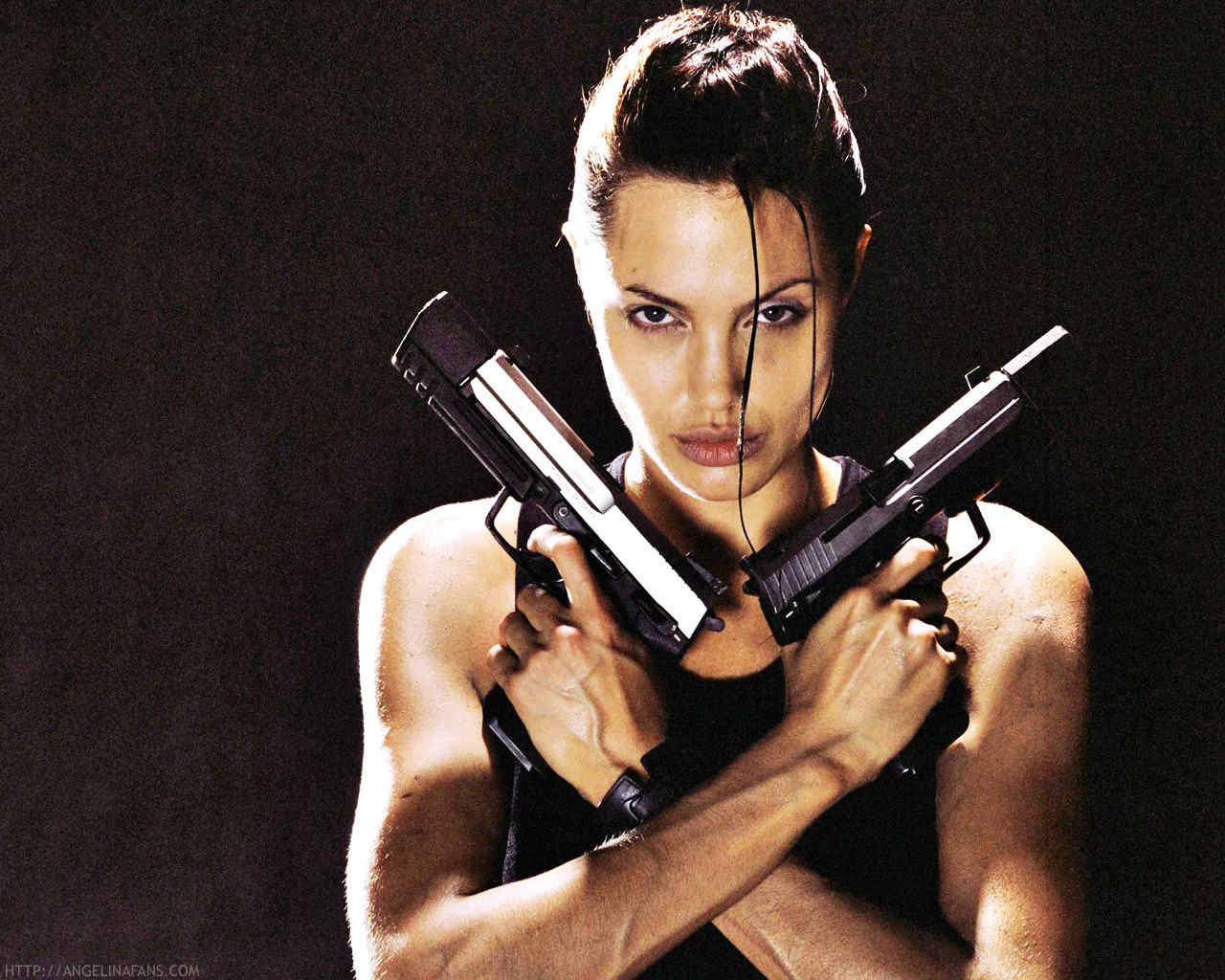
Female representations are commonly based on being stereotypical in Action Adventure films and most films wont break out of that stereotype as its easier to create a story line. one film that breaks out of this stereotype is 'Lara Croft - Tomb Raider' where the female protagonist is the strong, dominant character and the men are seen as 'weak' and inferior to her. Especially the antagonists as well as her sidekicks. She is also the only female in the film which means that the role of a 'Damsel in Distress' is taken my a male character, meaning that the hero has to be the female. This breaks out of the stereotype immensely.