After looking at my survey's responses i have discovered that my target audience is mainly going to be based around the age range of 16-20 year olds. For me personally this as easier as i'm in this age category and therefore can base the film poster partially on what i would want to watch in a film or see on a film poster. It has also became evident that my target audience consists mainly of females - amongst these females, six were 16-20 years old. Due to this I will also use a 16-20 year old on my film poster to attract the age group and to target this age group.
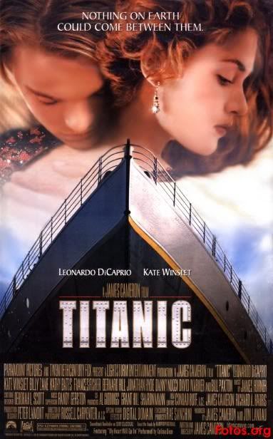
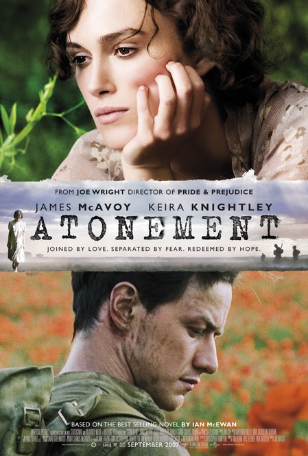
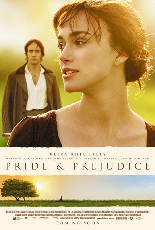
The top voted film genres I had were Romantic Comedy and a Horror or Thriller, each getting six votes. Due to this i had to then look back into which had the most female votes as females were my target audience. This was Romantic Comedy.
My film poster was also voted to include 'Bright, Attractive Colours', and 'Certain actors in the Films' - unfortunately I couldn't put certain actors in my film poster so i've decided to use the third highest voted option which was 'Dramatic Photo's of the Cast'. Upon discovering this information I've decided to use a single person on my film poster and base the film poster to them, using the rule of thirds and photoshop I will make my poster 'Bright and Attractive' but also 'Dramatic'.
I also asked if people pay attention to reviews found on film posters, the main response was 'Sometimes' and my second highest voted option was 'Yes'. I therefore will be including some kind of review on my film poster, it's also an idea to put on award badges (for example BAFTA or Emmys etc) as it makes film posters look more distinguished and seeing a film award logo is more likely to draw attention to a film poster and make it look more appealing it the film itself is supposedly good.
For the 'market research' for my double page spread i asked if people bought and read film magazines to which i got a staggering amount of no's - although the most voted option was 'No' I am still going to write a double page spread but I will use the additional information i discovered to make my double page spread appealing to read. I found out people tend to follow film trailers on Youtube which is something else i can write about in my double page spread that will also help draw in readers.
My survey results also mentioned - like before - the appeal of dramatic photos of the cast so in my doubt page spread I will be using photos of my 'model' to add this appeal.
Overall for my Romantic Comedy film poster my target audience are 16-20 year old females. My film poster will include bright, attractive colours and dramatic photos of the my model as well as these aspects being used in my double page spread.