Tuesday 21 October 2014

Kayleigh Manners - The X Factor


The X Factor is one of the UK's biggest entertainment shows and includes every age and gender representation. The programme's used to bring both humour to an audience and entertain that audience, the main aim of The X Factor is to find 'the next big thing'. Doing this includes showing both bad and good auditions from the public this is constructed to make the audience laugh and the bad auditions but love the good ones and make a reaction from the public based on their opinions of the singers. The X Factor also breaks all the stereotypes we associate with gender, age and sexuality.

An example of this is Kayleigh Manners. Although she gives the physical appearance of look 'tough' and confident in herself due to her clothing choices, hair and piercings. When she sang it was clear she isn't tough or confident at all and is very shy.

Age Representations in Music

I've chosen to do my age representation on Sia's 'Chandelier' as it involves a child in the music video.
The song is initially about the singer (Sia) being a party girl and drinking there are also references to sex throughout the song.
The music video however shows a young girl (Maddie Ziegler) aged eleven dancing around an empty flat. Throughout the music video the audience gets an idea that maybe the girl is mad or just alone as she's wearing a tan leotard that gives the impression from afar that she's naked (this indicates vulnerability) and she has drawings all over her hands - something only a child would do if their parents weren't around.
The song was made for young adults/teenagers of around 15/16-19/20 because of the references to sex and drinking and partying - something at this age people tend to do often.
Age is represented in the music not only in this aspect with children but with teenagers being classed as reckless and irresponsible. Women in music are often portrayed as objects of pleasure and not real people, they're also depicted in music videos especially to have sex appeal and often to not wear very little clothing.
Depending on the music and the artist its often easy to predict who the audience is for different songs in different genres - for instance, stereotypically - classical music is aimed at older people whereas more modern music thats in todays charts is aimed at teenagers, young adults and some older members of the public.

Thursday 16 October 2014

Textual Analysis - Coursework


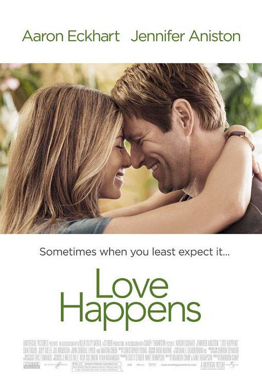
The first thing that draw your attention to this film poster is the image. Though it doesn't take up the space of the entire film poster, you still immediately look at the image. I personally think that having the image covering only part of the poster makes the film look more sophisticated. The rest of the poster has a plain white background as to not draw attention away from the image.
The next thing I noticed was the names of the two main actors starring in the film, Jennifer Aniston and Aaron Eckhart. Having two very well known actors names at the top of the film poster immediately is seen because by habit people will read from top to bottom, it makes more sense to have the actors names at the top rather than at the bottom.
The middle part of the poster is taken up with the films name, the font is extravagant or fancy its actually quite plain and simple, matching the mood of the film poster itself. The colours used in both the photo, background colour and font colours are all quite earthy and plain too.

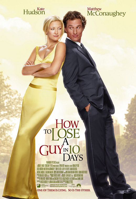
This film poster immediately gives the effect in my opinion of 'elegance' and being 'classy' due to the golden yellow colours used in the background and on Kate Hudson's dress, along with her blonde hair.
The colour scheme in this film poster is hard to depict as one theme - for instance 'earthy' - because the colours used are yellow/gold, red and different shades of green. Though the colours go to together and compliment the film poster well, the colours make all the words stand out at different times.
Like in the film poster 'Love Happens' the two main actors names are at the top of the film poster, partially because they'll be read there but also because these two actors are well known in films also and it will attract audiences from their previous films.
The films name 'How to Lose a Guy in 10 Days' is places strategically between the two main characters on the photo. This is layer out this way because when you're looking at the film poster you scan from left to right like you would when you're reading and by doing this you look from Kate Hudson, to the films name, to Matthew McConaughey.
The layout and style of the film poster is similar to that of a magazine cover, the fonts used are recognised in magazines and the placement of the actors along with any writing is to an extent the same as what you'd find on the cover of a magazine. This all fits into the theme of the film as the film revolves around two magazine companies.
The two actors are leaning up one another but rather than looking 'in love' they look like they're rivals or in competition with one another, they both in a sense look smug. As Kate is wearing an elegant, full length, golden gown she looks rather pure and angelic and Matthew is wearing a full suit in a dark, dark blue or black he looks the opposite. Smart but kind of 'devilish'. This plays with the idea of good V evil or the angel and devil.

Like the two previous film posters I've analysed you can see immediately that the actors names are at the top of the film poster again, their first names are in bright white writing so they catch your eye. The same applies here with the films name, the date the film is released and the slogan 'Friendship has its benefits'.
The layout of the scene also fits the name of the film 'No Strings Attached' as its in a bedroom with Natalie Portman wearing only a shirt that she's buttoning up, her hairs a bit messy and she's smiling at Ashton Kutcher who is sat on the bed with his shirt undone and one leg in his trousers. There is a shoe thrown on the floor and the bed is also messy which infers that they've just had sex.
I wouldn't say that theres a colour scheme as such to this film poster but the colours used are muted, not very bright
Tuesday 7 October 2014

Magazine Analysis - GQ

GQ is initially a magazine aimed at a sophisticated male audience of 25-39. This is proven through the main image of James Franco - a sophisticated actor in the age range of 25-39.
The main image shows Franco wearing a full suit and having a reasonably sophisticated hairstyle. He overall fits the codes and conventions of somebody who would appear on the cover of a magazine like GQ. The image of Franco fills the page also leaving only a small quantity of background (which is coloured a pale blue, this goes with the colour of his shirt and also contrasts well with the red on the masthead and the cover-lines. Even though the magazine is aimed at males, Franco could attract a female audience as he is very well known and attractive, even more so in the main image as he has a lot of sex appeal to females.
The masthead simply reads 'GQ' - the magazine's brand. The masthead always appears at the top of the magazine and on this cover its not only covering a part of Franco's head but its in bright colours. Red and white, these colours contrast well with the blue in the background and give the cover as a whole, a more sophisticated and modern look. The quotation underneath 'GQ' reads 'Look Sharp, Live Smart' - hence fitting into the convention of sophisication again. It also links back to the target audience as 25-39 year old men tend to want to 'Look Sharp' and 'Live Smart' whereas teenage boys or men their 50+ years have other priorities.
The cover-lines are all in white, red or black and their fonts are all very smart and not fussy with - for example- calligraphy. This again emphasis's that this magazine is for the sophisticated men of America rather than women. 'Our Big Style Issue' and 'The Next James Dean' are both written in red writing, this has the intention of drawing attention to these cover lines rather than 'Where to find he best wine in the world'. Some cover lines are wrote in black and white and are reasonably smaller than the cover lines in red. Though they all still stand out against Franco.