Thursday 11 December 2014

Representation of Age - Exam Prep

Find 3 specific examples of the representation of age in the media from a variety of contemporary texts (these must be from the last 2 years)

Advert (include year of advert)\

SMA Advert - 2013

This represents the age of children. There are eight main stereotype categories for children.

  1. As victims of horrendous crimes - Some critics of the media have suggested that While children who are victims of crime get more media attention than adults or children from ethnic minority backgrounds.
  2. As cute - This is a common stereotype found in television commercials for baby products or toilet rolls.
  3. As little devils - another common stereotype especially found in drama and comedy,  e.g. Bart Simpson.
  4. As brilliant - Perhaps as child prodigies or as heroes for saving the life of an adult.
  5. As brave little angels - suffering from a long-term terminal disease or disability.
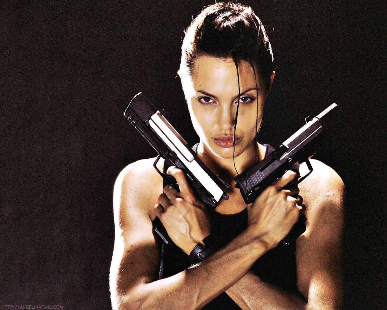
  6. As accessories - stories about celebrities such as Madonna, Angelina Jolie or the Beckham's may focus on how their children humanise them.
  7. As modern - the media may focus on how children 'these days' know so much more 'at their age' than previous generations of children.
  8. As active consumers - television commercials portray children as having a consumer appetite fro toys and games. Some family sociologists note that this has led to the emergence of a new family pressure, 'pester power', the power of children to train or manipulate their parents to spend money on consumer good that will increase the children's status in the eyes of their peers.
This advert portrays children as 'cute' as they're babies ad though they're acting naughty they're still cute to watch and the advert makes people - parents especially - smile or laugh.

Music Videos (pick a particular scene, exact times should be noted)

Break the Rules - Charli XCX

In the first five seconds of the music video we hear the non diegetic sound of a school bell ringing followed by a group of teenagers running down a corridor that's set to look like one you would find in a high school. The students are wearing a typical school uniform including white shirts and black trousers or a black skirt. Some of the students are carrying school folders or books. This all links in with the name of the song 'Break the Rules' as schools have several rules that students usually enjoy breaking. The use of teenagers also immediately gives you a sense of who the central target audience is for the song. This being young adults/teenagers (14-18), presumably females as its a female singer.
When the musics soundtrack begins the camera loses focus of the students running by and focus's solely on Charli and some girls behind her. They're not dressed the same as everyone else indicating they're already 'breaking the rules' by wearing provocative alternates to the school uniform. They're edited to be in a slight slower motion than the previous action to draw attention to Charli and what she's doing and wearing. The girls she is with are all very pretty too which along with Charli appeals to 'The Male Gaze Theory' and thus engages a target audience of males as well as females.
At 00:14 the setting changes to an American football ground's bleachers, the colour's being yellow and dark blue, the blue matching the skirt Charli is wearing and the jacket one of the other girls wears. The weather is also incredibly sunny and bright portraying the song is happy rather than sad. Due to the weather the lighting is soft and high-ish key rather than low key which would give the whole music video a depressing tone.
The scene changes again at 00:17 to only Charli stood on top of an American school bus, its also yellow thus linking into the yellow we saw earlier on the bleachers. The bus appears to also be on the football field with the bleachers in the back ground. The shot on Charli is an establishing/long shot of her and her whereabouts. The fact that Charli is on top of a school bus also links into the songs message of 'breaking the rules'. The she is stood on top of the bus she is wearing a black leather jacket, short shorts that show a bit of bum cheek, there are tassels coming from either her jacket of shorts too that cover part her legs but due to the movement don't keep covering them and sun glasses. Typically fitting the stereotype of a 'bad girl' almost linking to the stereotype of a 'biker chick'.
When Charli and her 'girls' enter the school bus (00:29) the bus driver looks the complete opposite of a bus driver as he has long dark curly hear, a baseball cap and headphones. He looks almost 'grungy' in his appearance and king of like a 'rocker' rather than a bus driver. Once on the bus (which only contains Charli and the girls) they all walk to the back half of the bus, something typically done by the 'bad' kids in a class. None of the girls are sat still, all are dancing or chatting or interacting with Charli who is singing directly to the camera, the shot used in this scene is a mid shot with occasional close ups of Charli herself singing. At 00:47 the girls and Charli begin to throw ripped up paper at each other and the camera indicating they're having fun and are once again breaking rules by making a mess and also ripping up paper as well as standing on the bus seats.
At 00:54 the camera is at a low angle watching at the bus drives past with Charli and the girls all hanging out the windows waving and throwing notebooks and paper towards the camera. For a second the camera closes up on Charli to show her having fun and initially looking like the ring leader of the girls and their behaviour.
Throughout he first minute of the music video the scenes switch from Charli dancing and strutting around on top of the bus, to Charli in the bus singing to the camera or having fun with her friends, or hanging out the bus presumably shouting or laughing; though this isn't heard due to the soundtrack playing but you see the action and intention of laughing or screaming.
After the school bell at the beginning of the music video no other sounds are used other than the soundtrack with Charli singing.


Film Trailers (Pick a particular Scene, exact times should be noted)

Nativity 2: Danger in the Manger - 2012

This is an film trailer specifically aimed at the audience of young children at Christmastime. We know it's aimed at young children because the film - as seen from the trailer - mainly includes primary school aged children.
In the first 10 seconds of the trailer the film misleads an audience to believe that the film is aimed at all ages at Christmastime but then as the trailer progresses we discover that the film is aimed more at a young audience in Primary Schools as the children in the film are all Primary School students as seen from 00:11 - 00:14. At 00:25 to 00:30 we see the teachers assistant 'Mr Poppy' encouraging the children to chase their new teacher around the playground. Something that can be seen as humorous to a young audience as every child would enjoy chasing and scaring their teacher with permission.
Mr Poppy is arguably a child himself despite being an adult as he goes against the Headmasters wishes and holds 'secret auditions' for the Christmas competition 'Song for Christmas' (00:38 - 00:49). This adds to the aspired audience of young children because Mr Poppy isn't like a normal teachers assistant and he encourages the children to do 'mad' and 'absurd' things that would never be done in a normal primary school.
We see more of the shenanigans encouraged by Mr Poppy from 00:58 - 1:11 in which he sneaks the children out the school and into a decorated vehicle, ties up the teacher Mr Peterson and drives across the country to Wales without the head teacher realising immediately and again at 1:15 - 1:20 when he gets into a fight with a rival schools teacher.
At 1:35 - 1:54 we hear the children's Christmas song and various scenes from the Song for Christmas competition and a funny clip of Mr Poppy and Mr Peterson changing a babies nappy.
This is a film blatantly aimed at children in Primary School and younger or young families due to the children in the cast being of that age group too. Though this is the primary audience, there is a secondary audience of other age ranges including young adults and people who enjoy Christmas.


Tuesday 4 November 2014

Ideas for Film Poster - Coursework

Ideas for Film Poster

  Has to be...

  • Romantic Comedy
  • 16-20 FEMALES
  • Bright & Attractive Colours
  • 'Dramatic' - To an extent

Ideas...

  • Rather than a boy and a girl, I like the idea of doing two girls on the front or the same person twice like 'The Parent Trap' or 'She's the Man'. Simply because it's different and wouldn't require more than two people.


  • I also like posters that have a transition from one image to another like 'The Last Song' or 'Titanic'. This has a good effect to it and would again, be different.


  • One image - Title - Another Image. 'Atonement' or 'Pride and Prejudice'. This means I don't need to have the two cast members together in a photo so I can use them separately.

Film Poster - Final Survey Conclusions - Coursework

After looking at my survey's responses i have discovered that my target audience is mainly going to be based around the age range of 16-20 year olds. For me personally this as easier as i'm in this age category and therefore can base the film poster partially on what i would want to watch in a film or see on a film poster. It has also became evident that my target audience consists mainly of females - amongst these females, six were 16-20 years old. Due to this I will also use a 16-20 year old on my film poster to attract the age group and to target this age group. 
The top voted film genres I had were Romantic Comedy and a Horror or Thriller, each getting six votes. Due to this i had to then look back into which had the most female votes as females were my target audience. This was Romantic Comedy. 
My film poster was also voted to include 'Bright, Attractive Colours', and 'Certain actors in the Films' - unfortunately I couldn't put certain actors in my film poster so i've decided to use the third highest voted option which was 'Dramatic Photo's of the Cast'. Upon discovering this information I've decided to use a single person on my film poster and base the film poster to them, using the rule of thirds and photoshop I will make my poster 'Bright and Attractive' but also 'Dramatic'. 
I also asked if people pay attention to reviews found on film posters, the main response was 'Sometimes' and my second highest voted option was 'Yes'. I therefore will be including some kind of review on my film poster, it's also an idea to put on award badges (for example BAFTA or Emmys etc) as it makes film posters look more distinguished and seeing a film award logo is more likely to draw attention to a film poster and make it look more appealing it the film itself is supposedly good. 
For the 'market research' for my double page spread i asked if people bought and read film magazines to which i got a staggering amount of no's - although the most voted option was 'No' I am still going to write a double page spread but I will use the additional information i discovered to make my double page spread appealing to read. I found out people tend to follow film trailers on Youtube which is something else i can write about in my double page spread that will also help draw in readers.
My survey results also mentioned - like before - the appeal of dramatic photos of the cast so in my doubt page spread I will be using photos of my 'model' to add this appeal.
Overall for my Romantic Comedy film poster my target audience are 16-20 year old females. My film poster will include bright, attractive colours and dramatic photos of the my model as well as these aspects being used in my double page spread. 

Tuesday 21 October 2014

Kayleigh Manners - The X Factor


The X Factor is one of the UK's biggest entertainment shows and includes every age and gender representation. The programme's used to bring both humour to an audience and entertain that audience, the main aim of The X Factor is to find 'the next big thing'. Doing this includes showing both bad and good auditions from the public this is constructed to make the audience laugh and the bad auditions but love the good ones and make a reaction from the public based on their opinions of the singers. The X Factor also breaks all the stereotypes we associate with gender, age and sexuality.

An example of this is Kayleigh Manners. Although she gives the physical appearance of look 'tough' and confident in herself due to her clothing choices, hair and piercings. When she sang it was clear she isn't tough or confident at all and is very shy.

Age Representations in Music

I've chosen to do my age representation on Sia's 'Chandelier' as it involves a child in the music video.
The song is initially about the singer (Sia) being a party girl and drinking there are also references to sex throughout the song.
The music video however shows a young girl (Maddie Ziegler) aged eleven dancing around an empty flat. Throughout the music video the audience gets an idea that maybe the girl is mad or just alone as she's wearing a tan leotard that gives the impression from afar that she's naked (this indicates vulnerability) and she has drawings all over her hands - something only a child would do if their parents weren't around.
The song was made for young adults/teenagers of around 15/16-19/20 because of the references to sex and drinking and partying - something at this age people tend to do often.
Age is represented in the music not only in this aspect with children but with teenagers being classed as reckless and irresponsible. Women in music are often portrayed as objects of pleasure and not real people, they're also depicted in music videos especially to have sex appeal and often to not wear very little clothing.
Depending on the music and the artist its often easy to predict who the audience is for different songs in different genres - for instance, stereotypically - classical music is aimed at older people whereas more modern music thats in todays charts is aimed at teenagers, young adults and some older members of the public.

Thursday 16 October 2014

Textual Analysis - Coursework


The first thing that draw your attention to this film poster is the image. Though it doesn't take up the space of the entire film poster, you still immediately look at the image. I personally think that having the image covering only part of the poster makes the film look more sophisticated. The rest of the poster has a plain white background as to not draw attention away from the image.
The next thing I noticed was the names of the two main actors starring in the film, Jennifer Aniston and Aaron Eckhart. Having two very well known actors names at the top of the film poster immediately is seen because by habit people will read from top to bottom, it makes more sense to have the actors names at the top rather than at the bottom.
The middle part of the poster is taken up with the films name, the font is extravagant or fancy its actually quite plain and simple, matching the mood of the film poster itself. The colours used in both the photo, background colour and font colours are all quite earthy and plain too.

This film poster immediately gives the effect in my opinion of 'elegance' and being 'classy' due to the golden yellow colours used in the background and on Kate Hudson's dress, along with her blonde hair.
The colour scheme in this film poster is hard to depict as one theme - for instance 'earthy' - because the colours used are yellow/gold, red and different shades of green. Though the colours go to together and compliment the film poster well, the colours make all the words stand out at different times.
Like in the film poster 'Love Happens' the two main actors names are at the top of the film poster, partially because they'll be read there but also because these two actors are well known in films also and it will attract audiences from their previous films.
The films name 'How to Lose a Guy in 10 Days' is places strategically between the two main characters on the photo. This is layer out this way because when you're looking at the film poster you scan from left to right like you would when you're reading and by doing this you look from Kate Hudson, to the films name, to Matthew McConaughey.
The layout and style of the film poster is similar to that of a magazine cover, the fonts used are recognised in magazines and the placement of the actors along with any writing is to an extent the same as what you'd find on the cover of a magazine. This all fits into the theme of the film as the film revolves around two magazine companies.
The two actors are leaning up one another but rather than looking 'in love' they look like they're rivals or in competition with one another, they both in a sense look smug. As Kate is wearing an elegant, full length, golden gown she looks rather pure and angelic and Matthew is wearing a full suit in a dark, dark blue or black he looks the opposite. Smart but kind of 'devilish'. This plays with the idea of good V evil or the angel and devil.

Like the two previous film posters I've analysed you can see immediately that the actors names are at the top of the film poster again, their first names are in bright white writing so they catch your eye. The same applies here with the films name, the date the film is released and the slogan 'Friendship has its benefits'.
The layout of the scene also fits the name of the film 'No Strings Attached' as its in a bedroom with Natalie Portman wearing only a shirt that she's buttoning up, her hairs a bit messy and she's smiling at Ashton Kutcher who is sat on the bed with his shirt undone and one leg in his trousers. There is a shoe thrown on the floor and the bed is also messy which infers that they've just had sex.
I wouldn't say that theres a colour scheme as such to this film poster but the colours used are muted, not very bright

Tuesday 7 October 2014

Magazine Analysis - GQ

GQ is initially a magazine aimed at a sophisticated male audience of 25-39. This is proven through the main image of James Franco - a sophisticated actor in the age range of 25-39.
The main image shows Franco wearing a full suit and having a reasonably sophisticated hairstyle. He overall fits the codes and conventions of somebody who would appear on the cover of a magazine like GQ. The image of Franco fills the page also leaving only a small quantity of background (which is coloured a pale blue, this goes with the colour of his shirt and also contrasts well with the red on the masthead and the cover-lines. Even though the magazine is aimed at males, Franco could attract a female audience as he is very well known and attractive, even more so in the main image as he has a lot of sex appeal to females.
The masthead simply reads 'GQ' - the magazine's brand. The masthead always appears at the top of the magazine and on this cover its not only covering a part of Franco's head but its in bright colours. Red and white, these colours contrast well with the blue in the background and give the cover as a whole, a more sophisticated and modern look. The quotation underneath 'GQ' reads 'Look Sharp, Live Smart' - hence fitting into the convention of sophisication again. It also links back to the target audience as 25-39 year old men tend to want to 'Look Sharp' and 'Live Smart' whereas teenage boys or men their 50+ years have other priorities.
The cover-lines are all in white, red or black and their fonts are all very smart and not fussy with - for example- calligraphy. This again emphasis's that this magazine is for the sophisticated men of America rather than women. 'Our Big Style Issue' and 'The Next James Dean' are both written in red writing, this has the intention of drawing attention to these cover lines rather than 'Where to find he best wine in the world'. Some cover lines are wrote in black and white and are reasonably smaller than the cover lines in red. Though they all still stand out against Franco.

Tuesday 30 September 2014

Analysis of Charli XCX - Break the Rules

Charli XCX - Break the Rules.


In the first five seconds of the music video we hear the non diegetic sound of a school bell ringing followed by a group of teenagers running down a corridor that's set to look like one you would find in a high school. The students are wearing a typical school uniform including white shirts and black trousers or a black skirt. Some of the students are carrying school folders or books. This all links in with the name of the song 'Break the Rules' as schools have several rules that students usually enjoy breaking. The use of teenagers also immediately gives you a sense of who the central target audience is for the song. This being young adults/teenagers (14-18), presumably females as its a female singer.
When the musics soundtrack begins the camera loses focus of the students running by and focus's solely on Charli and some girls behind her. They're not dressed the same as everyone else indicating they're already 'breaking the rules' by wearing provocative alternates to the school uniform. They're edited to be in a slight slower motion than the previous action to draw attention to Charli and what she's doing and wearing. The girls she is with are all very pretty too which along with Charli appeals to 'The Male Gaze Theory' and thus engages a target audience of males as well as females.
At 00:14 the setting changes to an American football ground's bleachers, the colour's being yellow and dark blue, the blue matching the skirt Charli is wearing and the jacket one of the other girls wears. The weather is also incredibly sunny and bright portraying the song is happy rather than sad. Due to the weather the lighting is soft and high-ish key rather than low key which would give the whole music video a depressing tone.
The scene changes again at 00:17 to only Charli stood on top of an American school bus, its also yellow thus linking into the yellow we saw earlier on the bleachers. The bus appears to also be on the football field with the bleachers in the back ground. The shot on Charli is an establishing/long shot of her and her whereabouts. The fact that Charli is on top of a school bus also links into the songs message of 'breaking the rules'. The she is stood on top of the bus she is wearing a black leather jacket, short shorts that show a bit of bum cheek, there are tassels coming from either her jacket of shorts too that cover part her legs but due to the movement don't keep covering them and sun glasses. Typically fitting the stereotype of a 'bad girl' almost linking to the stereotype of a 'biker chick'.
When Charli and her 'girls' enter the school bus (00:29) the bus driver looks the complete opposite of a bus driver as he has long dark curly hear, a baseball cap and headphones. He looks almost 'grungy' in his appearance and king of like a 'rocker' rather than a bus driver. Once on the bus (which only contains Charli and the girls) they all walk to the back half of the bus, something typically done by the 'bad' kids in a class. None of the girls are sat still, all are dancing or chatting or interacting with Charli who is singing directly to the camera, the shot used in this scene is a mid shot with occasional close ups of Charli herself singing. At 00:47 the girls and Charli begin to throw ripped up paper at each other and the camera indicating they're having fun and are once again breaking rules by making a mess and also ripping up paper as well as standing on the bus seats.
At 00:54 the camera is at a low angle watching at the bus drives past with Charli and the girls all hanging out the windows waving and throwing notebooks and paper towards the camera. For a second the camera closes up on Charli to show her having fun and initially looking like the ring leader of the girls and their behaviour.
Throughout he first minute of the music video the scenes switch from Charli dancing and strutting around on top of the bus, to Charli in the bus singing to the camera or having fun with her friends, or hanging out the bus presumably shouting or laughing; though this isn't heard due to the soundtrack playing but you see the action and intention of laughing or screaming.
After the school bell at the beginning of the music video no other sounds are used other than the soundtrack with Charli singing.

Thursday 11 September 2014

Gender Representations in Films.

Gender Representations in Films.
Gender is represented in  Action Adventure film genre's as the male typically being the stronger, more dominant sex and females being stereotyped as 'Damsels in Distress'. This is especially shown in the Action Adventure film 'Spiderman' as the main female character is constantly seen as 'helpless' and 'weak'.

Females are also depicted as being attractive and having a sex appeal to draw in the male audience and make the female audience want to look like her an example of this is . The same applies for male characters as they're shown as being muscular and toned and attractive which brings in a usually large female audience and a male audience.

Female representations are commonly based on being stereotypical in Action Adventure films and most films wont break out of that stereotype as its easier to create a story line. one film that breaks out of this stereotype is 'Lara Croft - Tomb Raider' where the female protagonist is the strong, dominant character and the men are seen as 'weak' and inferior to her. Especially the antagonists as well as her sidekicks. She is also the only female in the film which means that the role of a 'Damsel in Distress' is taken my a male character, meaning that the hero has to be the female. This breaks out of the stereotype immensely.