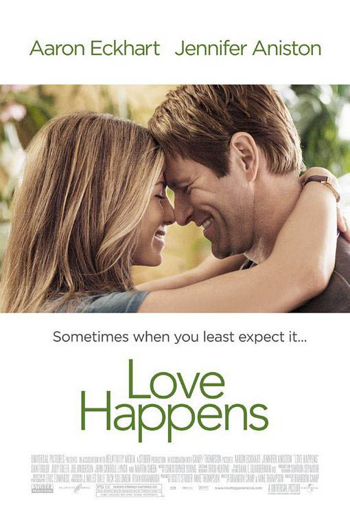
The first thing that draw your attention to this film poster is the image. Though it doesn't take up the space of the entire film poster, you still immediately look at the image. I personally think that having the image covering only part of the poster makes the film look more sophisticated. The rest of the poster has a plain white background as to not draw attention away from the image.
The next thing I noticed was the names of the two main actors starring in the film, Jennifer Aniston and Aaron Eckhart. Having two very well known actors names at the top of the film poster immediately is seen because by habit people will read from top to bottom, it makes more sense to have the actors names at the top rather than at the bottom.
The middle part of the poster is taken up with the films name, the font is extravagant or fancy its actually quite plain and simple, matching the mood of the film poster itself. The colours used in both the photo, background colour and font colours are all quite earthy and plain too.
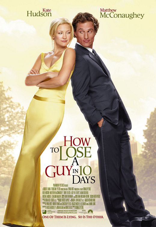
This film poster immediately gives the effect in my opinion of 'elegance' and being 'classy' due to the golden yellow colours used in the background and on Kate Hudson's dress, along with her blonde hair.
The colour scheme in this film poster is hard to depict as one theme - for instance 'earthy' - because the colours used are yellow/gold, red and different shades of green. Though the colours go to together and compliment the film poster well, the colours make all the words stand out at different times.
Like in the film poster 'Love Happens' the two main actors names are at the top of the film poster, partially because they'll be read there but also because these two actors are well known in films also and it will attract audiences from their previous films.
The films name 'How to Lose a Guy in 10 Days' is places strategically between the two main characters on the photo. This is layer out this way because when you're looking at the film poster you scan from left to right like you would when you're reading and by doing this you look from Kate Hudson, to the films name, to Matthew McConaughey.
The layout and style of the film poster is similar to that of a magazine cover, the fonts used are recognised in magazines and the placement of the actors along with any writing is to an extent the same as what you'd find on the cover of a magazine. This all fits into the theme of the film as the film revolves around two magazine companies.
The two actors are leaning up one another but rather than looking 'in love' they look like they're rivals or in competition with one another, they both in a sense look smug. As Kate is wearing an elegant, full length, golden gown she looks rather pure and angelic and Matthew is wearing a full suit in a dark, dark blue or black he looks the opposite. Smart but kind of 'devilish'. This plays with the idea of good V evil or the angel and devil.

Like the two previous film posters I've analysed you can see immediately that the actors names are at the top of the film poster again, their first names are in bright white writing so they catch your eye. The same applies here with the films name, the date the film is released and the slogan 'Friendship has its benefits'.
The layout of the scene also fits the name of the film 'No Strings Attached' as its in a bedroom with Natalie Portman wearing only a shirt that she's buttoning up, her hairs a bit messy and she's smiling at Ashton Kutcher who is sat on the bed with his shirt undone and one leg in his trousers. There is a shoe thrown on the floor and the bed is also messy which infers that they've just had sex.
I wouldn't say that theres a colour scheme as such to this film poster but the colours used are muted, not very bright
No comments:
Post a Comment